|
This fall I was asked to teach in a Digital Cultures Art History/Visual & Performing Arts class. The students were prepping an assignment that could be a research paper or a research-informed creative project. The professor also mentioned that covering digital archives, digital humanities, and copyright were on the table for her, so I had both a lot of leeway and a lot to cover. As I planned this class, the final plan had a pretty dramatic gear shift in the middle of the session.
I don't drive stick.
0 Comments
This semester, I was invited to present in the class geared toward creating the annual issue of the student literary and arts journal at UCCS, riverrun. I was given free rein to cover whatever I thought the students should know, and I took the opportunity to do a class I've been hoping to take for a test drive: IS! THAT! FAIR! USE!
As part of my cataloging internship at the Federal Highway Administration Research Library through the Summer Transportation Internship Program for Diverse Groups, I wrote and presented original research on contemporary Korean collage depictions of the urban space. This combination of words might raise questions like "how was that relevant to cataloging?" and "why isn't this in the research section?" which are both completely valid. In order to make this presentation relevant to my audience (the engineers and librarians at the Turner-Fairbank Highway Research Center), I turned this paper presentation into an opportunity to give a brief orientation to Library of Congress Subject Heading and Call Number assignment.  I first ran through my paper's argument to provide the necessary subject background. I kept to a very tight three minutes (out of a 10 minute presentation) for introducing myself and the paper to the audience to gesture to the experience of cataloging something with which you may not have subject expertise. I then introduced the subject headings we used in the FHWA Research Library and a selected few headings that I thought would be applicable to the paper if I were to be cataloging it as a whole work. Finally, I showed a few call number options with their meanings to point to the fact that in the vast majority of cases, a work can only live in one place in a collection.
At about the six minute mark, I opened the presentation up to discussion. I asked the people assembled if they heard anything in my description of the paper that they hadn't seen represented in the subject headings and what they thought about the differences between the two thesauruses. As the audience threw things out, I took advantage of a nearby whiteboard to write down what they were saying next to what I had presented. I closed out by guiding the conversation to highlight the human-ness of cataloging and the importance of the person assigning subject headings to the finding process. If I had had more time, I would have found a way to make the discussion more active. At the time, I had a brief daliance with the thought of going through classweb with my audience but ultimately scrapped that idea for time. With the benefit of hindsight, I would have very much liked to do a very quick think-pair-share before introducing my subjects and/or to do an opinion gradient on two of the call numbers to see which one people thought was more correct. All that said, I feel that my learning objective of "introduce the process of subject headings and call numbers" was accomplished. I got an email later that day from one of the engineers saying that he had learned a lot both about the work of art and the work of cataloging from my presentation and had really enjoyed the conversational element. To see an image of the art work at the core of my paper, click the read more. Adapted from Tatsiana Zhurauliova. 1. What is represented in the object? Make an inventory of items. 2. Materials: list the materials and describe their visual qualities. 3. Format and size: round? square? small? large? what is the support of the object? 4. Line: identify the linear elements. Are they emphasized or deemphasized? What kind of lines are there and where do they point? 5. Geometries and formal echoes: what shapes are in the piece and do they repeat? 6. Color: identify the colors and their qualities. Are they bright? saturated? How are they distributed? 7. Organization of forms: How is 3d space implied? Is it implied? Is there negative space? 8: Relation to viewer: how does the object engage the viewer? Where are you located in relation to the object and what it depicts? 9. Temporal extension: does the object imply a narrative or action? Does it attempt to invoke timelessness? How does it do those things? This is the framework I use for performing and teaching art history and formal analysis. I learned it from Dr. Zhurauliova in her 20th Century Art class. One of the things that I think works really well is the way each element feeds into the next. I simplified the language to make it easier to use with children but did not rearrange any of the content. I find that by the first three questions are really good warmups for people that might be intimidated by art history or art. These elements are very easy to identify from the tombstone and has the effect of giving someone new to the process very concrete things they can identify. Once they get through those, looking for other elements doesn't seem as intimidating. I have applied this framework to 2d and 3d objects from painting to decorative arts and found it useful in all cases.
This was the third and final in the Learning to Look kids series. In this session, I wanted to engage with material and materiality. The learning objectives were to get the kids thinking about the role of material in the way art conveys its message and to further reinforce the concepts of formal analysis by introducing sculpture since previously they had been analyzing two dimensional objects. When confronted with non-painting objects, the kids were confused about how to apply their formal analysis skills. However, with a little coaxing, I got one or two of the older ones to get on board with the process.
My main take away from this session is not to use Will to Power in future iterations of this session. While it is arguably the best, clearest example of Art Informel, it provoked too many giggles. Additionally, the second set of images was too abstract for the younger kids and a lot of them seemed to tune out. The craft was successful and affirmed that kids love collage. This one seemed especially fun because we broke out the feathers, pom-poms, and craft sticks, so there was more than just colored paper and discarded books to play around with. Art or N'art was the adult learning component of my Learning to Look series at the Harrison Public Library. I was asked to give a lecture in part on my work and in part on some topic of general interest on an evening in mid-August; the topic I chose was the nature of art. As a modernist, I get a lot of questions about whether what I focus on is "really art" or not, so I figured it would be a fun lens with which to look at the progression of art in the 21st century. The learning objectives were to identify the aspects of a display object that the audience for this talk considered constitutive of "art" and, through discussion" to begin to develop a working definition.
Using the slide deck (partially) seen here, we worked through art since 1900. Of the small crowd that showed up, folks started to get engaged with the "artiness" of the objects under discussion around surrealism. By intentionally choosing objects that pushed be bounds of traditional art forms, I sought to challenge the audience to think about the social construction of the art object. The conclusion that they came to was that the only object we looked at that wasn't art was Haacke's "Shapolsky et al." That was instead nicely presented investigative journalism. One of the things that went really well was the selection of objects. Each piece served the purpose of the talk well and none of them went without some comment from the audience. One of the things that didn't go as well was overall participation. Of those comments, most of them came from one person. That one person was very engaged, but I would like to have been able to get more people involved. Next time I run an instruction session like this, I would cut down on the number of pieces. I would also like to make the artists discussed more diverse thant what I included here. This would add the learning objective "introduce artists excluded from the art historical canon to the audience" which I think is achievable given the response to this session. 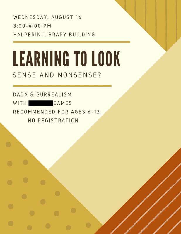 Sense and Nonsense was the second in the Learning to Look Series. The objectives here were to introduce Dada and Surrealism to the kids and to reinforce the concepts of formal analysis.
This session had the most successful activity component, which made up for the lackluster discussion aspect. The kids got really into the collage. Fewer chose to do the exquisite corpse exercise, but every kid chose one of the proposed activities. I think it was the fact that they got to use glue that really made it fun, so in the future I will try to chose craft projects that involve collage. The kids remembered some of the terms from the week before and partially remembered the order they went in, so I consider the reinforcement of formal analysis techniques a success. If I were to do a session like this again, I would also include a collage based surrealism activity. 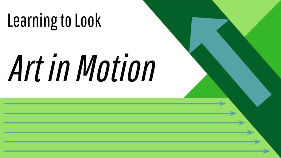 Art in Motion was the first in the Learning to Look series that I ran at the Harrison Public Library. It was aimed at kids ages 6-12 but was designed to also be interesting to any caregivers or parents that accompanied them to the session. The topic was the ways turn of the 20th century artists depicted movement. The objectives were to familiarize the kids with the major concerns of the Impressionist and Italian Futurist movements and to introduce the process of formal visual analysis.
Of the whole series, I think this one went the best. The first painting was clearly representational and they really got into looking at the formal elements of the painting and how they come together to tell a story. The second painting is more abstract, but was chosen because it features a train to tie in to HPL's popular "Train Time" programming which draws a lot of folks from the community. Kids love trains. Once the train was found in the morass of colors and shapes, they got excited about identifying and analyzing the formal elements. The activity portion of the hour was fun but not as effectively connected to the art as I would have liked. The craft prompt was to draw or create something that they thought invoked movement with the suggestion that they think about a time in their lives where there is a lot of motion like getting ready in the morning or recess. Most of the kids went the path of just making whatever they felt like. However, it doesn't feel like a total failure because the kids had fun. In assessing the success of the event, I am proud to say that both the parents and the kids got involved. The kids started using a lot of the formal vocabulary in identifying the elements of the painting over the course of the hour and the parents got involved by asking questions about the artists and the context of the paintings. The kids asked probing questions about the context as well and, in the case of the first image, were able to construct the concerns of the art movement from the formal elements of the painting with little prompting. The futurist painting was a little more challenging but they grappled with it really well. In the future, I would more clearly direct the activity, perhaps by limiting the materials available for crafting, to encourage them to do the activity as designed. I want it to still be open ended, especially for the younger kids, but I also want to drive home the concerns of the movements through the activity. |
Interested in any of these? Use the Contact tab to be in touch!
You can also view the current state of these activities on my instruction menu: Categories
All
Archives
October 2022
|
 RSS Feed
